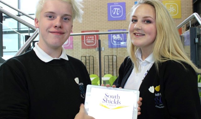
A STUDENT voice has been heard loud and clear as a North-East school gains a new name, image and ethos.
Recently appointed head teacher Allie Denholm enlisted the help of her students to give the school an image makeover to match its new positive culture.
South Shields School has taken the ‘community’ out of its name but left the ethos at the very heart of its principles.
The new logo features gold colouring because students said they aimed to be the best and wings symbolising the resilience of a phoenix, indicating that the school prepares its students to fly into independent living after leaving school.
Mrs Denholm said: “The governors wanted to change the name so our Student Voice spent a great deal of time and effort looking at a new one and potential designs for the branding.
“They decided that the name should be the place they identify with, hence South Shields School.”
Head girl Megan Morton, 15, said: “With the logo, gold signifies value, the wings show we can overcome any obstacles and even the font is like that of the Jack Wills clothing brand so it will be recognised as cool.”
Head boy Connor Marshall added: “We have a new amazing head teacher and we wanted to take the name and brand further with a redesign that students could feel they owned.”
Students worked with branding specialists Urban River and in-house graphic designer Sharon Walker to extend the brand across the school website, planners, televisions and stationery. Next year, student uniforms will adopt the logo.
Mrs Denholm said: “Our students and governors love the new branding because it puts South Shields at the very heart of everything we do.”
